
My Steam review was too long, so I've posted the full thing here instead.
TL:DR - Super pretty. LOTS of potential that was squandered. Should have been a VR title. Can't recommend.
Intro:
The Invincible needed to be a VR game instead of a classic game, as well as needing a few other fairly substantial tweaks to make it great. Right now it's simply middling. (Unlike other reviews, I paid for my copy and I now wish I'd waited for news of a VR update).
The Good:
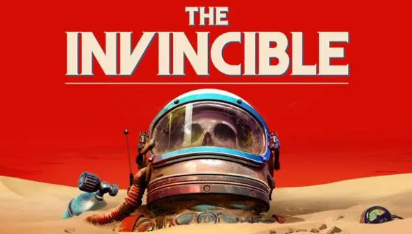
- Top of the list is the aesthetics. The Atom Punk look and feel is this game's major appeal when "playing" it. The art direction is not just great, but iconic. If you understand what I mean when I say iconic, it means that The Invincible now own this look, and that any other game that tries to use this look will be described as having a The Invincible aesthetic in its reviews. THAT'S how much they nailed this look. It was also my single greatest reason for buying the game. Truly outstanding design. Just beautiful.
- It's more of an interactive visual novel, and that's not a criticism. I like this kind of experience, but it doesn't make for an entertaining game in the classic sense. So why is this comment in The Good section?? Because The Invincible has ALL the characteristics of what makes for a great VR experience. Landscapes of immense scale, interesting aesthetics, large easy-to-operate equipment, an ever-visible helmet (and face mic), a full body, lots of exploration, getting close to other NPC's faces, very detailed hands, climbing!, the tracker, and on and on. All these things really work in VR, but in this version of the game, they don't seem to hit the mark like what the creators were originally intending. This is included in The Good section because if ported to VR these features will absolutely shine.
- Driving in the Rover. (Again, would have been AMAZING in VR). A really fun vehicle, that also looked great.
- The Anti-Matter Bots. These were terrific and it would have been great to have seen more of them. I would have especially enjoyed being able to control a broken one with limited functionality and get it to shoot its laser. This would have been both a great thrill, but also an excellent intro into using the same tool we use at the end. When we finally do use this device (at the end of the game) we would have already been familiar with it and enjoy the greater freedom we have with it.
- The Force Field generators. Impressive scale and visuals. I would have loved to have activated one and seen it hollow out an area, or turn one off and then see an unstable cliff collapse as a result of that action.
- The Flying Saucer - Too bad we never saw it when it was flying. It looked SO cool!
- The Robot helpers - Too bad we never to to control one, or even have one help us. I would have loved for a situation to necessitate it sacrificing itself for us. Wow, that would have been amazing, but sadly it wasn't in the game.
The Bad:
- The Story's dialogue. This was based upon a classic novel from 1964, which I haven't read, but I felt the dialogue between my female character and the Astrogator was very old-fashioned and it sincerely wouldn't have hurt the reputation of the book if the speech was modernised away from what I felt was a very patriarchal tone. There was an obedience that the main character gave to her superior that seems very out-dated now. It would have been great for her to have gone a little more rogue and question the whole concept of authority now that she was alone on a strange planet. When there was a dispute in ethics, which I liked, she agreed to disagree and got on with the mission, and his plan. There should have been way more fight in that dialogue. "Hey, I'm the one down here risking my life. You either help, and do what I say, or abandon me and have to live with that for the rest of your life. Now what's it going to be?" She needed more of that. For the most part, however, I found the repetitiveness of the dialogue rather grating. When the Astrogator asked for an update and the main character answered, "Nothing in the last 5 seconds, sir", I would have heard that line about 20 times. Surely the actors could have given you 20 different versions of this theme instead of repeating it 20 times. I would have opted as a rule to never repeat dialogue. Also, the last dialogue in the Condor was excruciatingly long, and to be required to sit through that to find the alternate endings seemed like hard work. Also, I didn't want to hear how "this mission has dragged on", or "how heavy my legs feel". (With the low gravity they really shouldn't have felt heavy at all).
- The Story's unanswered questions. One of the most fun and fascinating parts of the game was tracking the underground network of strange steel objects. This was a real mystery to me, and sadly it stayed that way because we never got to the bottom of what it was, or saw what it did. If you take a page out of Subnautica's book you'll see how their mysteries had genuine pay offs, but in The Invincible they did not. For example, what even was The Invincible? It looked like a gigantic ship, but it was so far away we never really knew what it did, or why we should care about it. I found the story in general quite hard to follow, mostly because the old-timey waffle between the characters would get in the way of what they might actually have been trying to communicate to me. Conversation prompts became such a meaningless chore that I paid less and less attention to them the more the game went on. In terms of communicating a story in a game, you should be embracing "Show don't tell", and with dialogue, "less is more". When a character speaks it needs to push the story, not fill a silence. (I would have preferred silence, and been able to work it out for myself from exploring the game's world, and whenever a character does have to speak: It's important).
- The Story's lost opportunities. We soon realise that our memory is being affected by the planet's flora. It would have been terrific to have played around with that a lot more, like what they did with the movie Memento. This may have become a Groundhog Day-like experience where you need to re-do something you've done before, not knowing why it back the way it was, or even how many time's you've done this now. Waking up from a blackout, having lost the tool you were using, or any tools, in a different environment, and needing to work things out from there. You wake to find your rover is crashed. "Did I do that?" A different character in front of you. "Did he do that?" Is he a friend or foe? "Who are you? Have we met before?" Your journal becomes a detective novel for your own life. Photos/sketches of people are already there: "Friend" You wake up again, check your journal and see the same sketch scratched out: "Dead". How did that happen? That would have completely transformed the game experience in a good way.
- No consequence. We were never able to die and then had to try a section again because of it (at least I never encountered this). I would have loved to have needed to escape from the Anti-Matter Bot's laser, and not succeed. Or run out of oxygen trying to save my colleague. Or any number of events that may have escalated the tension. Having to run from a faulty robot trying to get you, but needing to sneak around the enemies base to reach their control panel and shut the robot down. Stuff like that.
- Movement. It was too slow. I don't mind slow, however this was too slow, especially as the gravity was light enough for me to easily carry a dead body. If, instead of running, you gently moon-hopped like the astronauts do in real life. That would have made a bit more sense. But my main criticism was getting blocked by a length of piping on the ground, or a small ledge, which I should have easily been able to step over or climb over, only to have to walk around it. That was bad enough, but to then be perfectly able to scale a large chunk of rock many times larger only a short distance away _really_ didn't make sense, and was annoying. Another gripe about movement was that the rover wasn't able to reverse. That made getting out of tight spots very laborious.
- The Invincible lacked big moments, or taking advantage of big moments it did have. I liked the idea of this being an exploration game, but I felt as though the few moments of action that were peppered throughout this game weren't capitalised on. A perfect example of this was the saucer. We really needed to be taken on that whole flight path and seen the explosion of sand when we "landed". And to see our pilot black out just before and be in that moment of terror. Instead, we saw nothing. Many wonderful moments, or important moments (for the story) were communicated poorly. The worst example was remembering a moment when you were back onboard the Dragonfly and it had us sat in front of a monitor hearing dialogue from your crew mates down on the planet. This was anything but fun.
Conclusion:
The bones of a great game are there, but it needed to be fleshed out a lot more and made into a much more entertaining experience, even if that meant departing from the original novel to do so.
What I'd LOVE is for this game to be given a moderate-sized overhaul in terms of game design, and really provide the oomph it deserves. Yes, a re-invention, but one that wouldn't require scrapping the whole thing, but instead adding or re-working what's already there, with brave & bold decisions, into something great. And then make it for VR. My hope is that the profits you make from this version go into the conversion for VR, and during that conversion process many of the criticisms are addressed, and the lost opportunities gained. That's my greatest hope. Again, the bones are there, it just needs a re-think/re-work in some key places, and the bravery to really take it to that bold new place.
Until then this is a game that has great potential, which is all within arm's length, but for whatever reason wasn't able to reach it at launch. Perhaps it is a project that ran out of money during production, and needed to take short cuts with their interactivity. That would explain most of the criticisms I have above. Perhaps they needed a stronger game designer (I'm available, by the way). Perhaps they stuck too close to the original novel and didn't give it the modern injection of life it deserved. (This game is an _interpretation_ of a novel, after all. "Based on" is fine). Whatever the reason, it truly is unfortunate that the potential of this game excites me more that the what the actual game does, even though I still enjoyed playing it. Until it reaches this potential, however, I cannot recommend it.


